
The journal · Notes on writing objects

Details worth
a closer look.

A few considered notes on choosing a pen, finding a finish, and turning a familiar object into something distinctly yours.

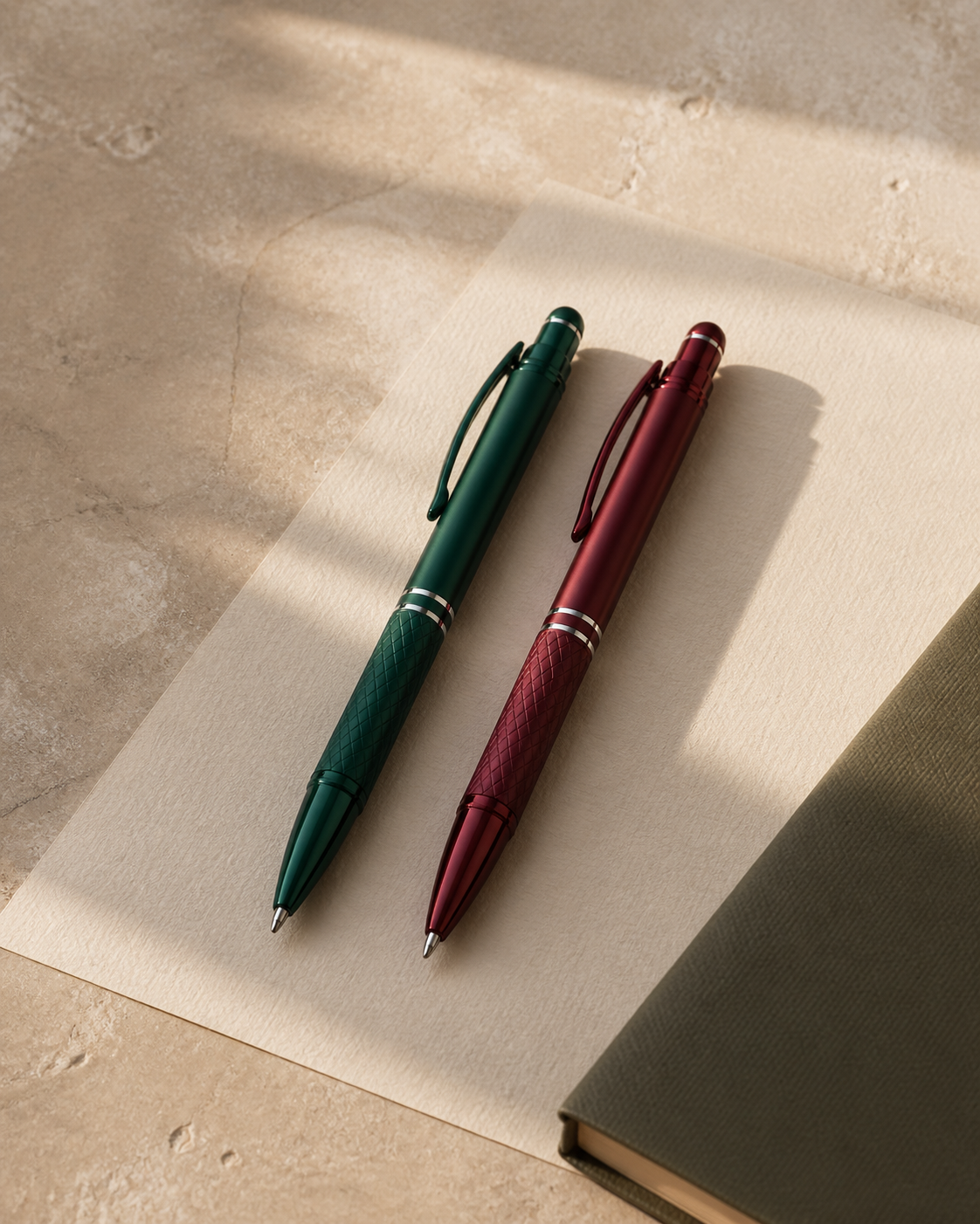
An editorial still life of green and burgundy metal pens on textured paper
A writing moment · Editorial illustration

01 / The everyday object

What makes a pen
feel right?

It begins with something a specification sheet cannot quite capture: how it feels when you pick it up.

Read the noteClose the note

Start with balance. A pen does not need to be heavy to feel substantial; the relationship between its length, grip, and weight matters more than any one number. When comparing samples, write a few full sentences rather than a quick signature.

Then consider the small movements. Is the mechanism comfortable to use? Does the clip sit neatly? Does the barrel feel secure without requiring a tight grip? These details become more noticeable when the pen is used every day.

Finally, think about the person receiving it. A compact everyday pen and a more substantial presentation piece serve different moments. The right choice brings the object and its purpose together.

Explore the collection →
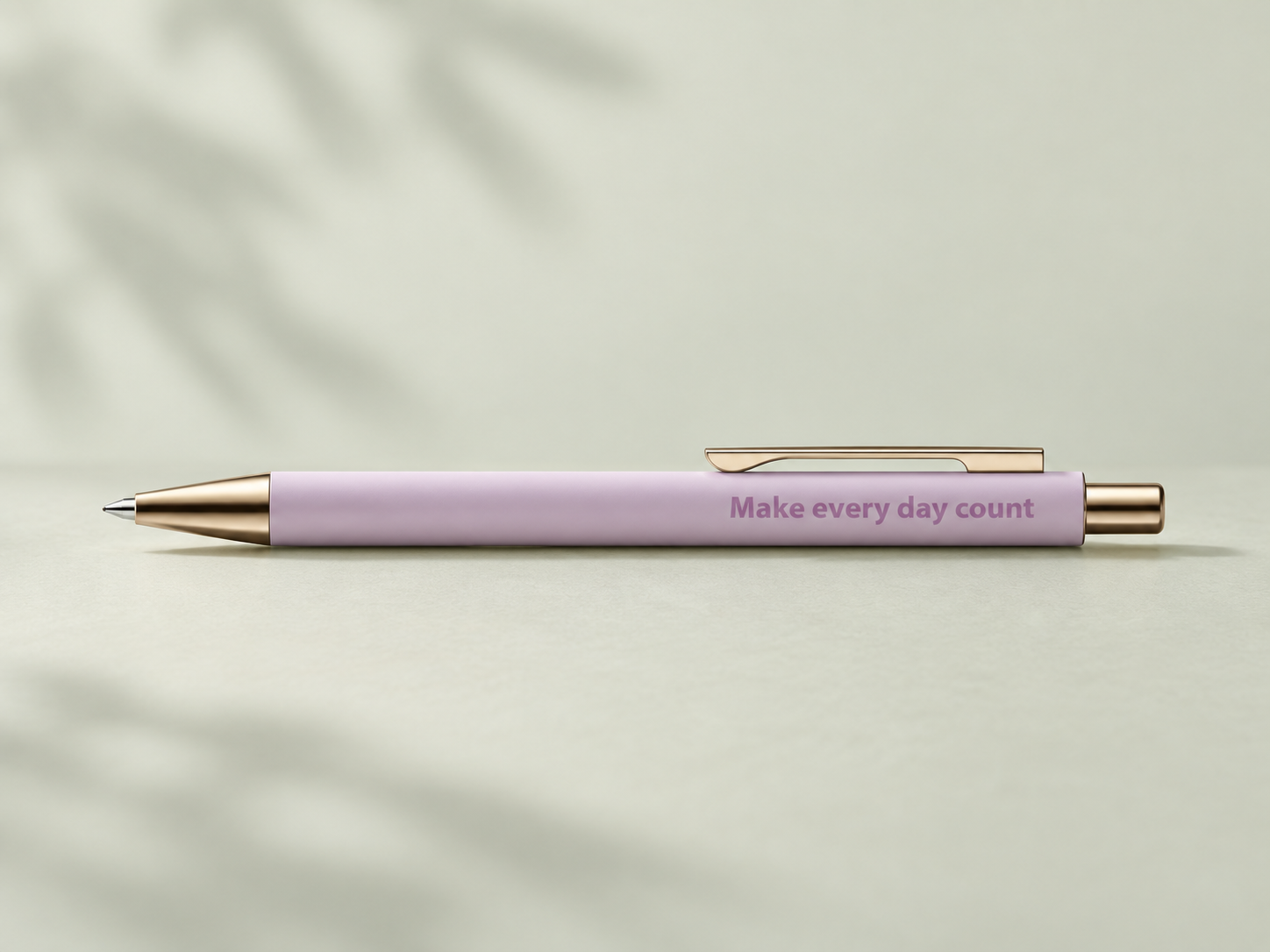
From the notebook.

Materials · Finish · Identity

02 / Surface & character

Choosing a finish is choosing a feeling.

A matte surface, a brushed texture, a polished detail. Each changes the way light meets the pen.

Read the noteClose the note

Look at a finish in more than one light. A surface that appears quiet on a desk may show much more depth in daylight. Matte finishes soften reflections, while polished details introduce a brighter accent. Brushed textures add a directional quality that changes as the pen turns.

Color and marking should be considered together. An understated barrel may work beautifully with a subtle engraved name; a more expressive identity may call for a printed logo with greater contrast.

A physical sample is the most useful reference. Hold it, turn it, and see how the surface relates to your artwork before making the final choice.

Compare marking techniques →

03 / A considered identity

Good branding knows when to leave space.

A pen offers a small canvas. The clearest mark is often the one that gives every detail room to breathe.

Read the noteClose the note

Begin with the essential part of your identity. A long tagline, a detailed symbol, and a web address may compete for attention when reduced to a narrow barrel. Decide which element matters most, then build the layout around it.

Check the artwork at its intended size, rather than only enlarged on a screen. Fine lines and small lettering can behave differently across marking methods. A simplified version of a complex logo may give a clearer result.

Send the original vector artwork where possible, together with any color references and placement preferences. Leave room for the product’s own proportions to guide the final composition.

Discuss your artwork →
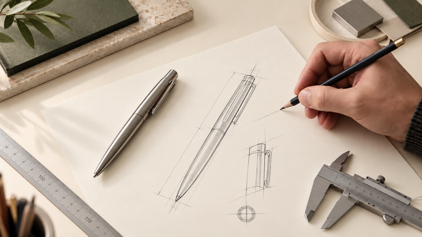
Illustrative pen design study with sketches and a prototype
Design illustration

04 / Before production

Make the most of your first sample.

Give a sample a little time on your desk. The best decisions come from using the object, not just looking at it.

Read the noteClose the note

Use a sample as your intended recipient would. Try it on your usual paper, clip it to a notebook, and write for more than a moment. Note how the grip, mechanism, and writing feel work together.

If branding is part of the project, review the placement and scale beside your other materials. Check the appearance in natural light and compare the sample against the agreed artwork.

Keep your feedback specific: the model, finish, quantity, and any detail you would like to adjust. A clear reference makes the next conversation with your manufacturing partner much more useful.

Ask about samples →

An idea taking shape?

The next good detail
could be yours.

Explore Changshu
Let’s talk ↗

Made for your brand

Your inquiry0